The Roxfire brand refresh is a sign of growth, here we express the unique personality and direction of Roxfire’s future with an updated attitude that can be felt and seen.
BRAND MOOD BOARD BEFORE (LEFT) AND AFTER (RIGHT)
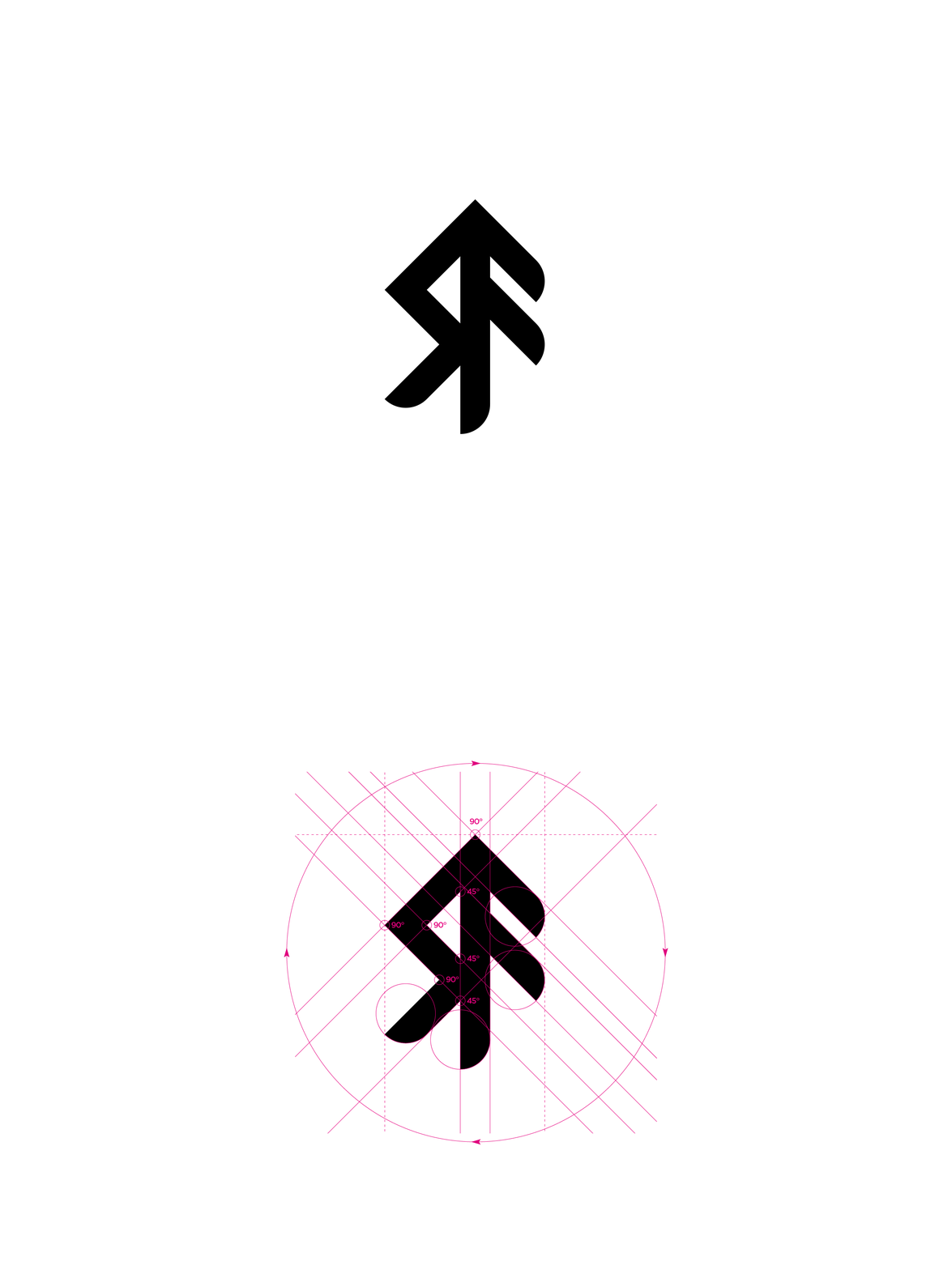
LOGO REFRESH BEFORE (LEFT) AND AFTER (RIGHT)
The original logo was created from a tough, bold, masculine image with hard edges and a rigid stance. Roxfire’s new logo expresses movement and an even bolder presence while also achieving a smoothness that is welcoming and intriguing.
COLOR PALETTE - Color design by Emily Gibbemeyer.
TYPOGRAPHY
MAIN BACK WALL VINYL WRAP ART
VINYL WRAP FOR MAIN BACK WALL - SCALE REFERENCE
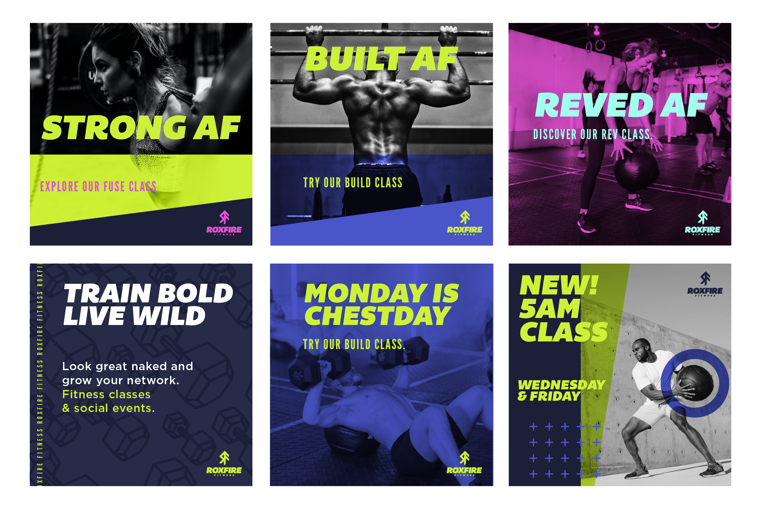
DIGITAL MARKETING DESIGN


